While there is no official coworking logo (and may never be one, per se), there are have been some efforts to develop a logo for the coworking community, and for such a logo to serve as the identifying symbol or community mark.
If you have developed a logo for the community, please add it here. Note that all submitted logos shall be considered offered under the liberal Creative Commons Attribution-ShareAlike license or entered into the public domain.
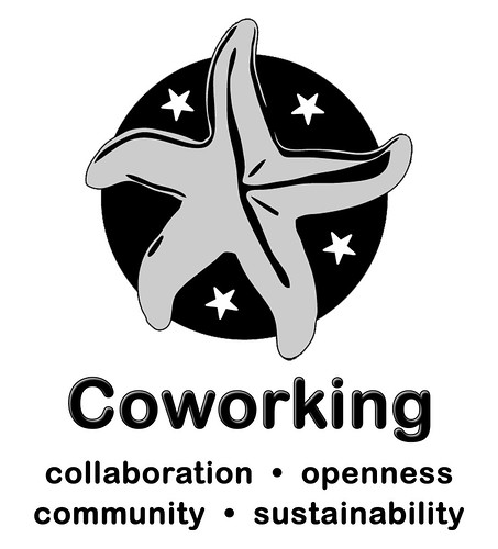
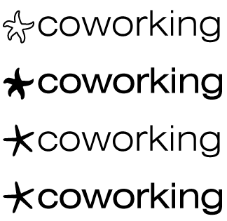
By Chris Messina
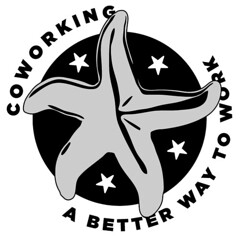
Download EPS.
Download EPS.
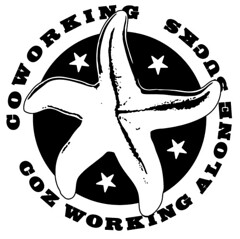
By Tony Bacigalupo
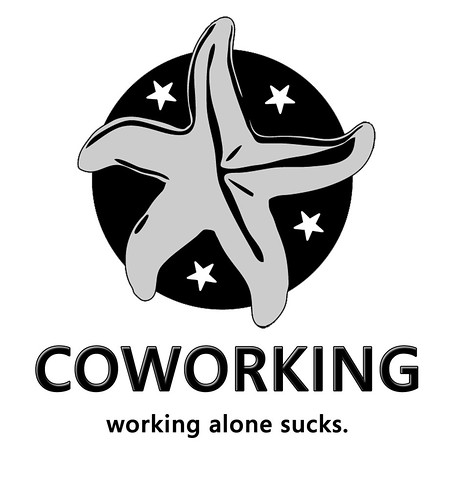
More versions here.
PSD's/EPS's available upon request.
Comments/suggestions/revisions welcome.
From Todd O'Neill, San Antonio, Texas
I am not a graphic designer (although I play one on TV). So I mocked this up in PowerPoint (shudder).
I'm going for simpler, iconic, shrinkable (favicon size), able to be monochromatic, self descriptive.

Green circle for the world (sustainability; community; international); orange in-pointing arrows (collaboration; active, hot energy color; cause it set off from green well); blue out-pointing arrows (creativity; calm; cool energy color; it set off from orange and green well.)
I think this needs to be an adoptable icon like the RSS icon or the WiFi icon or the USB icon. (I'm not endorsing those icons but they are adopted, universal, international.) That can take years.
Our coworking "graphic" would probably need a label under/above it for some time period until it becomes "the icon".
I think the starfish is cool (that's where the inspiration came from for this one) but I think it may be too "starfishy". My opinion.
While I did this at my kitchen table over breakfast I explaine coworking to my daughter and what I was doing. She asked "What's the synergy symbol?" I said Yin Yang (maybe not entirely accurate but that could be the start of something also.)
I had one more idea that I could not execute. It's line/block drawings of people (like the men's room figures) facing each other over a desk, sitting on top of a globe. My daughter came up with this independently (without me telling her what I had been thinking) when I explained coworking to her.
I really like this community. Thanks everyone.
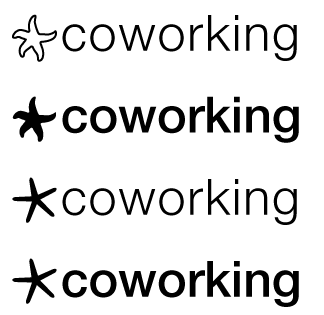
By Sean O'Steen

I think I understand Tara & Chris' vision and really like the Starfish logo. In my mind however, I keep wanting to turn it into an asterisk. So, mocked a couple of them up. Here's #1 with a skinny starfish similar to the one found on the cover of "The Starfish and the Spider."

Here's version #2, using Chris' fatty organic starfish with the B&W inverted.
--
Sean´s "asterisk" idea inspired me to think about an (e)motional logo (likegizmoz)

...and Hillary (s. below) inspired me to think about this approach:

By Félix Trépanier
Some examples with the sinny starfish. (Thanks for help Math!).
I shamelessly used the image from The Starfish and the Spider web site and reused a similar concept for adding the words.
Not as polished as some other examples, but you get the idea.


These logo attempts are an obvious homage to the simple and highly extensible BarCamp logo. I took Chris Messina's source files and tweaked the hell out of his starfish, then chose a few fonts that look good, are clear, and will print well in one color. The last file has a couple of "radar" rings next to the logo. There is an old coworking logo floating around that is a combo of the Ritual Roasters logo and an RSS logo. I put 4 rings there to symbolize the FourPillars that everyone else has mentioned. To me, if we're going with the idea that this will be a call to action for an entire community, it needs to be as simple as the BarCamp and DevCamp logos.
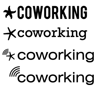
Please leave comments at flickr (the images click through to the pic). Download an EPS of the starfish/radar bits.
!
I like the idea of individuals coming together and sharing resources. When you go scuba diving, you see lonely starfish at the bottom, so I thought I would try something where these guys finally find each other. I know that tagline is sorta funny, I think there is some validity to communism, though, like not having everything be "mine" and thinking about the greater good of all. The world doesn't have endless resources and its nice to share...
!
!

!
Here is theEPS
!
By
These are some Starfish based comps that I set up. I am working on a few more so stay tuned.
!

!

!

!
!
New Comps
!
So I got inspired today and created some new logo comps:


 The one below was just me playing with color a bit.
!


A logo for a Barcamp, you can use the starfish alone as well.

Contact me if you want the starfish alone and you're not a designer or if you want the sourcefile (@volpeo on twitter or by mail: sylvain[at]volpeo.fr).
Note that this logo is under Creative Commons 2.0 BY NC SA Sylvain Peigney (Volpeo)
